Use CSS Grid in production — today
Everyone wants CSS Grid. It’s about a new layout method that will significantly change the way we design our content on the Internet. With CSS Grid you have the opportunity to place content in an unprecedented form on a website and sort it dynamically between viewports. This technique has therefore emerged, as many authors of websites had too limited possibilities working with the grid. With regard to the variety of devices on which websites are presented today, this state had not been sustainable. CSS Grid was created.
Yes, CSS Grid is new.
It is a new technology that recently emerged so we have to look around in the ecosystem of this technology and see where we can use that technology. Since this technique has to be supported by the browser, we can verify the current browser support on caniuse.com.
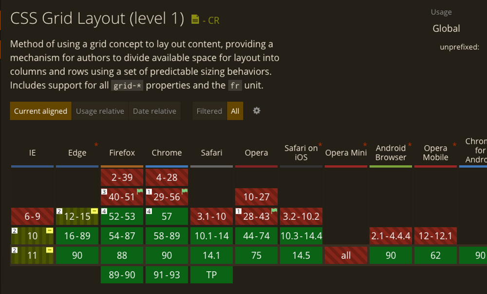
The support for CSS Grid is already pretty solid.
This shows us that all common browsers are supporting CSS Grid. But what if the customer wants support for IE 10 + 11 or earlier versions of Internet Explorer? I try to answer this question in this article.
Use Autoprefixer
There is a common problem with showing CSS attributes in all browsers with the same effect, so fully automated tools have been developed that can improve your code and you can make yourself a coffee, a quick coffee, because it all happens in less than one second. On tools like Autoprefixer you should take a closer look. Autoprefixer is a tool that checks your CSS code and adds the necessary attributes to unify your code in all browsers. With Autoprefixer you could thus cover all browsers in which CSS Grid attributes are supported including Internet Explorer 10 / 11. For browsers that are not supported you use fallbacks.
Plan fallbacks with the first line of code
Since there are still browsers that do not support CSS Grid (around 10% of all browsers worldwide), we rely on creating alternative solutions. Fallbacks come into play here. This technique works by detecting unsupported browsers and then providing them with other code they support. The best way to do this is to use the following argument if you have decided to support IE10+11 over -ms prefixes
@supports (not(display: grid)) and (not(display: -ms-grid)) {
  /* normal css code here */
}
If you want to use different code for Internet Explorer 10 and 11 and other non-functioning browsers, you can use the following fallback directive:
@supports (not(display: grid)) {
  /* normal css goes here */
}
With these @support queries you have the possibility to design your layout for older browsers completely independent of CSS Grid.
Convince your customer with the right arguments
You should convince your customers of this new and exciting technology. Advantages here are the responsive restructuring of content and the better accessibility of a layout method, which otherwise can only be guaranteed by “heavy” frameworks such as bootstrap.
Through fallbacks which cover the browsers that do not have CSS Grid support, you can use this technology today without hesitation.
CSS Grid will take over
In 1–2 years you will be able to eliminate the fallbacks from your code. Browsers such as Internet Explorer will be replaced by Edge or other browsers with CSS Grid support, and CSS Grid will prevail as a layout method on websites.